How to Design a Consistent Look for a Book Series
Designing a cohesive look for a book series is a crucial element in creating a recognizable and professional brand.
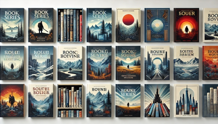
Designing a cohesive look for a book series is a crucial element in creating a recognizable and professional brand. Whether you're working with a book cover designer in the UK or a book publishing company, the key to success lies in maintaining visual consistency across all titles. This article explores the essential steps and strategies for achieving a unified design that reflects both the content of the books and the author’s brand.
1. Establish a Core Visual Identity
The first step in designing a consistent look for a book series is to define a visual identity that will tie all the covers together. This includes deciding on core elements such as color schemes, typography, and key imagery that will be used consistently throughout the series.
-
Color Scheme: Choose a set of colors that reflect the tone and themes of the series. For example, darker tones like black, grey, or deep blue might be used for mystery or thriller genres, while vibrant colors like red or yellow might suit action-packed or adventure stories. These colors should be used across all covers to create a sense of unity.
-
Typography: Select fonts that are easy to read and reflect the style of the book. Consistent use of typography across the series helps establish a cohesive look. For example, a serif font might be used for a classic literary series, while a modern sans-serif font might suit contemporary fiction.
-
Visual Elements: Decide on consistent design motifs, such as symbols, patterns, or images that can appear across all covers. For example, if the series involves a particular character or object, this element should appear on each cover in a similar way, even if the cover art varies.
2. Maintain Consistency in Layout and Composition
While each book in the series will have its own unique elements, the layout and composition should remain consistent. This ensures that when the books are displayed together, they look like part of a cohesive whole.
-
Cover Layout: Keep the placement of the title, author name, and other text elements in the same position across all covers. This helps readers immediately recognize that the books belong to the same series, even if they are standing alone on a shelf.
-
Image Placement: The positioning of images or illustrations should follow a consistent pattern. For example, the main image could always be placed in the center or slightly off-center, with the title at the top or bottom.
-
Spine Design: For physical books, the spine is just as important as the front cover. Make sure that the spine design is consistent across all books in the series, with the title, author name, and series logo or image appearing in the same layout.
3. Adapt to the Genre and Target Audience
A book cover should not only be consistent within the series but also resonate with the genre and target audience. The design should reflect the themes of the books while appealing to the readers’ expectations.
-
Genre-Specific Design Elements: For instance, a fantasy series might feature intricate, ornate designs and mythical creatures, while a historical fiction series might focus on classic typography and muted colors. Understanding the conventions of the genre will help guide your design choices.
-
Audience Appeal: Consider the age group and interests of your target audience. A young adult series might benefit from bold, graphic designs, while an adult fiction series might lean toward more subtle, sophisticated artwork.
4. Use a Professional Book Cover Designer
Collaborating with a professional book cover designer, especially one based in the UK, can make a huge difference in achieving a polished and consistent look. A book cover designers uk will have the expertise to create designs that not only look great but also function well in the marketplace. They can help refine your visual identity and ensure that your covers are tailored to the genre and audience.
-
Portfolio Review: When selecting a designer, review their portfolio to ensure they have experience working on book series and understand the importance of consistency. A designer with a strong portfolio will know how to balance creativity with cohesion.
-
Collaboration: Work closely with your designer to ensure that your vision is accurately reflected in the covers. A good designer will provide you with options and feedback to make sure the final result aligns with your goals.
5. Test and Iterate
Before finalizing the design, it’s important to test how the covers look together. Print mockups of the series or use digital tools to see how the designs work side by side. This will give you a clear idea of whether the covers have the desired impact when displayed together.
-
Feedback: Get feedback from potential readers, fellow authors, or book publishing companies to see if the design resonates with your target audience.
-
Adjustments: Don’t be afraid to make adjustments to ensure that the series looks cohesive and appealing. Small tweaks to color, typography, or imagery can make a big difference in achieving a unified design.
Conclusion
Creating a consistent look for a book series is a strategic and creative process that requires attention to detail and a deep understanding of both design principles and audience expectations. Whether you’re working with a UK-based book cover designer or a publishing company, the key is to establish a strong visual identity, maintain consistency across all elements, and ensure the design speaks to the genre and audience. By following these steps, you can create a book series that is visually cohesive, memorable, and appealing to readers.
What's Your Reaction?